Bent on Creation Redesign
Overview
In the fall of 2011, I decided a redesign was in order for my personal site. I had a few reasons for this. One, I needed to update the look of the site to better reflect my design ability. And two, I wanted to recommit myself to blogging and being actively engaged online. With a new design, I realized a proper logo was also needed, so I started there.
Logo
I began by sketching out several logo concepts in my notebook. With a name like “Bent on Creation,” I was making associations to earth, a sunrise, a tree, a starburst/big bang and industrial-era inventions. But none of these fit well.
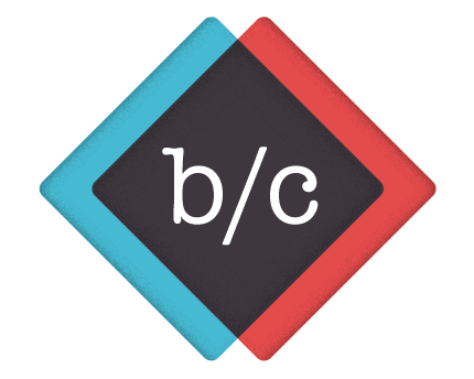
I ended up going with a simpler abstract shape: two overlapping diamonds. This shape better reflected me, personally. As a web designer and developer, I work in the overlap of two disciplines. The outer portions of the diamond shapes form angle brackets, hinting at HTML and underscoring my web focus. The “b/c” is set in American Typewriter, which has a nostalgic, mechanical feel that reminded me of monospaced fonts (another hint at coding).
Design
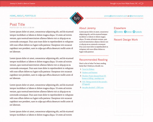
I wanted a design that focused on content, incorporated fresh typography and used a color scheme I hadn’t worked with previously. I wanted a layout that was balanced and maintained good vertical flow.
I thought the basic layout of the original site was working well, so I kept it the same: one main column on the left, two smaller sidebar columns on the right. Logo centered at top of page and navigation elements to the right and left of it.
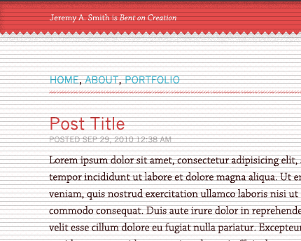
I used a 6px vertical baseline grid to maintain vertical rhythm throughout the layout. All type is set to this grid, as well as most other key elements.
I chose Rooney Web for body copy and Franklin Gothic for headlines, navigation and meta elements, both served up by Typekit. I used Gedy Rivera’s social media icons for the Dribbble, Github and LinkedIn links.
Responsiveness
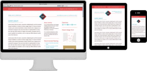
From the beginning, I intended to make the site design responsive. With the original three-column layout already set, I worked down from there to the smallest layout. I set breakpoints that would allow the sidebar columns to stack at the first breakpoint, then drop below the main content area after that. I decided not to use flexible widths on containers because I wanted to ensure optimal text line length for reading. I decided not to go any wider than a 960px layout at the largest because text line lengths would be much longer than recommended, with no added benefits that I could see.
Code
I coded the design in HTML5, using HTML5Shim for IE7 and IE8. Since this is my personal site with an audience skewed toward modern browser usage, and since time was limited, I opted for the Universal IE6 CSS stylesheet as a baseline stylesheet for IE6 users.
To maintain the 6px vertical baseline grid I used in the Photoshop comp, I created a repeating transparent png with 6px vertical rules that overlaid my web layout until the CSS work was finished. I finished up by creating a basic Wordpress theme out of the design with two widget areas for the sidebar content.
Final Analysis
After a month or so, I’m still fairly satisfied with the new logo and design. I’m very happy with the responsive layout and intend to improve it for smaller viewports (specifically, the navigation). There are a few site sections and additional sidebar information yet to be developed, but those will come in time. I had hoped to write a small Rails CMS to run the site, but couldn’t fit it in the schedule. Wordpress already does everything I need and is easy to install and create themes for.